Print first. Then the little things.
Start with whatever catches your eye: a colour, a familiar subject, a pattern you keep returning to. Then give the shirt a second look. Seeing the whole design and its smaller details together can help you decide what you would enjoy wearing.
Our Wearable Art edit brings the wider world together. Here, we slow down with Vintage Disc, women’s Paint Splash and Flight Map in Navy.
A rhythm you can see.
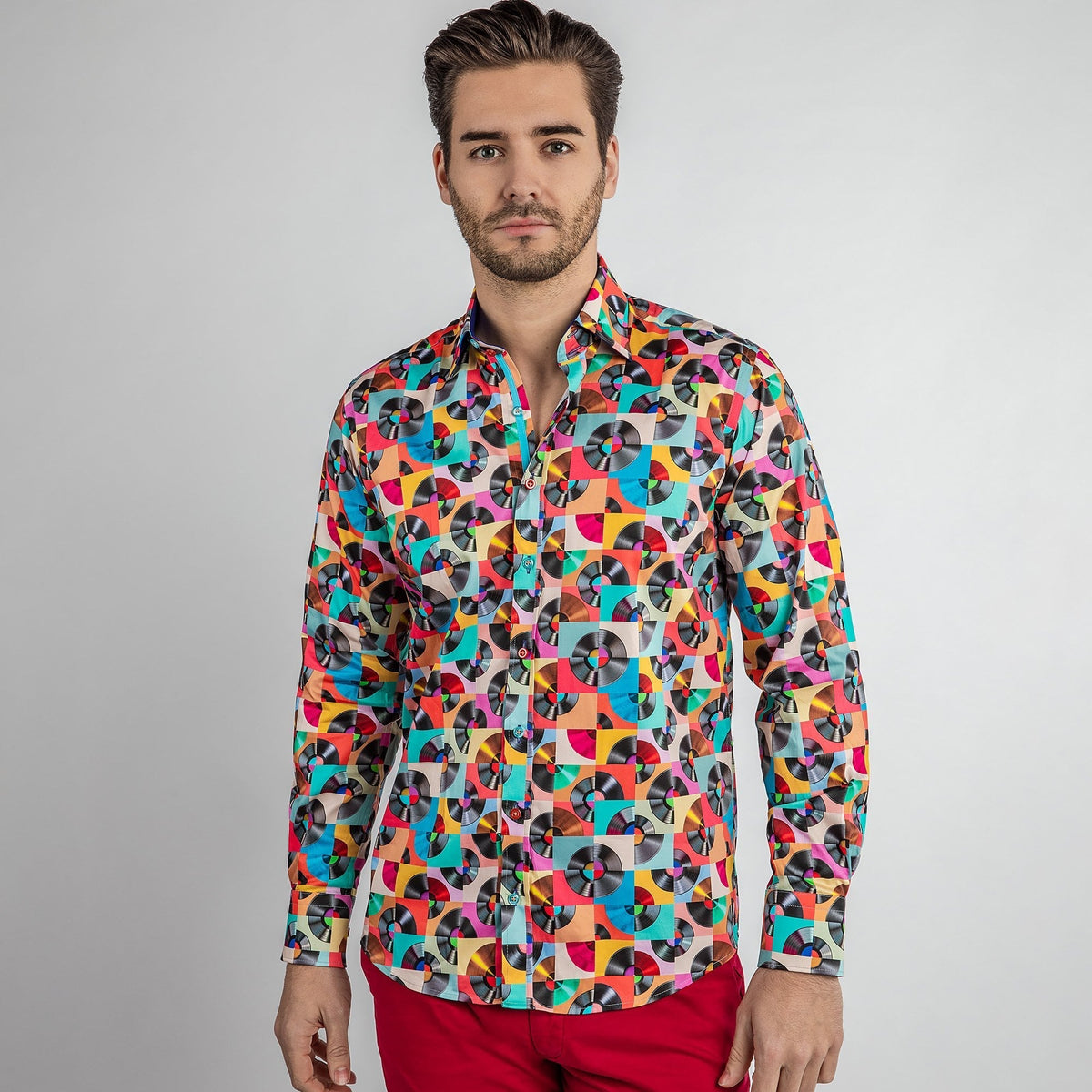
In the opening photograph, Vintage Disc reads as a lively composition of round record motifs and blocks of colour. The repeated circles give the whole shirt a rhythm, while pink, turquoise, yellow and peach keep the eye moving.
The closer photograph changes the emphasis. You can follow the print around the collar, notice the coloured buttons and see the deep blue inside. It is the same shirt, with another layer of detail.

Open the Vintage Disc cuff detail

Colour across the whole shirt.
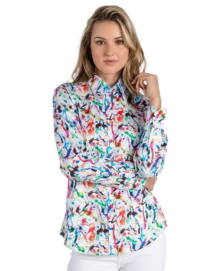
Women’s Paint Splash places bright marks across a white ground. The front view lets you see how the colours travel across the body and sleeves, rather than judging the design from a small square of print.
Move to the closer photograph and the turquoise inner collar becomes a clear accent. The cuff photograph reveals that colour again. If turquoise is what you noticed first, those smaller details may be part of the appeal.


Open the Paint Splash cuff detail

A print with places to go.
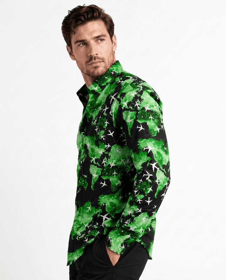
Flight Map in Navy has its own two-distance effect. The full view brings the dark ground and scattered colours together. The close-up reveals aeroplanes, map shapes and smaller marks that make the subject clear.
Use those views for different questions: do you enjoy the overall pattern, and do you connect with the subject when you look closer? A familiar interest can be a useful starting point for choosing a print.


Open a larger Flight Map print detail

Photographs in this section show Navy; other colourways have their own details.